Design is my career so I unintentionally look at everything and check spacing, check colors, check legibility, check line breaks, etc. It’s maybe not the best trait because I can’t ignore bad art and design which is all over the place. Allow me to share.
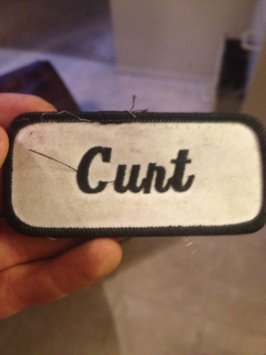
Swishy brush fonts are tough. Too much swishy and it looks like a different letter. And sometimes the swishies between two letters touch and you get problems. Let’s not forget the “Clint” nametag incident. “Curt” isn’t workin’ too good either.

Back when we could go places I used to frequent a Korean takeout place. This was the packaging for their chopsticks.

I thought it said OW! for way too long.
Good To Go! A lovely cafe in White Plains where I live. Look at how the tree is nestled between the D and the T. That works.

So why is your overhang this? Why? With the tree as the T? Which is a similar brown to the sign so you can’t see it? It you made the tree white it might have been fine. Please get ladder and fix. Please. It hurts my heart.


I used to pass this in Grand Central Terminal every day.

Perfect. Papyrus, now with the addition of Comic Sans. It’s circled back around to glorious.
And finally…

Everything. Everything is wrong with this. And I had to stare directly at it when I went to the bathroom. Truly blessed.
Addendum: I love how each animal gets crappier as your eye slides down the painting.
